Tuesday, November 11, 2008

Mess up with my face....


By Derrick Cheng...

Brain Face Prduct....


by Derrick Cheng...

Brain Face Logo.....


Cool Flash Effect

I made a cool smoke effect with flash 8 Pro, but unfortunately blogger doesn't allow swf files so you'll need to deal with still frames :(

Smoke:
Step 1:
I made a circle and put a radial gradient on it (this is a movieclip symbol)


Step 2:
I motiontweened it over the coarse of one second (thirty frames) and on the last frame; set the alpha to zero so it would do a fadeout effect.

Step 3:
I made the motiontween its own symbol and put this code in it:

onClipEvent(load){
var movement = Math.random(-5)*5;
}
onClipEvent(enterFrame){
_x += movement;
}
onClipEvent(enterFrame){
_y -= 5;
}

This code makes it move in a somewhat random direction leaning towards an upper-right diagonal direction.

Step 4:
I extended the frame to 59 frames and then duplicated the layer 30 times. Then I offset the layers so that they were each one frame apart.


Step 5:
I made some layers specifically for actionscript and put some gotoAndPlay functions all over the place. The end result looked like this:
Andy.S


Field Assignment, by: NZ

Brianface products!


GB

myself messed up


GB

Monday, November 10, 2008

Come & Get Me!


m.l.

Face Merge by HM


...i have nothing to say... the picture says it all

Face Combine and Distort

Here is my Photoshopped distorted face, which looks like plastic surgery gone bad.


J.M

Couchy-Muffin studios

Visit my blog!


Andy.S

Photoshopped image of Andy.S


A bit of scott, hanna, and myself.
Andy.S

Matt's New Face


M.S

Sunday, November 9, 2008

BORED A WORK: A Trilogy by HK


Part One: Snoozies and Sugarhighs

I work at the Canadian Clay and Glass Gallery. I work most Sundays. Sometimes I wonder.. why am I here? We sell almost nothing on Sundays. There are a few reasons, and I know them all:

Reason 1: People are at home, asleep.
Reason 2: People are at church, asleep.
Reason 3: People are at home stressing about the week ahead.

And so, I am forced to create activities to stimulate my brain. This wards off insanity and boredom-induced comas. At least, that's what I'm goin' for. Below you will see two crappy cell phone photographs. An original sketch by yours truly (I mean me), depicting my love for our CommTech Family. The other is a photo of what we call the "Emergency Drawer" at work. It's full of Doritos, Pocky, Tea, and Cookies. I eat junk from it... often.

Field Assignment 4 - by HM

I know I'm a day late... sorry Mr. Bishop!

For my 4th field assignment, I have decided to "Create a Special Effect". I am going to show you guys a simple way of making something pretty cool, using Photoshop. I am going to be using Photoshop CS3, but the other ones should be relatively similar... k, so here goes.

Creating Radial Stripes in Photoshop
1. Open up a new canvas in Photoshop, let's make it 500 x 500 px, with background colour as transparent.
File > New
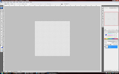


2. Notice that my rulers are on. To do this, simply press "Ctrl + R", or "Cmd + R" on a Mac. Next, use the Rectangular Marquee tool to draw a rectangle slicing the square into two portions horizontally. Fill one end in with the colour that you want one stripe to be. Then select the other ("Ctrl + Shift + I", or "Cmd + Shift + I" on a Mac), and fill the other square with whatever colour you want the second stripe to be. To fill in with colour, simply use the fill tool to fill in the highlighted/selected region. The colours I will be using are a nice yellow and a contrasting blue. The numbers are: d7ff00 (yellow) and 0653d6 (blue). After you're done, this is what it should look like.
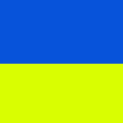


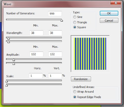
3. Next, go into Filter > Distort > Wave. A dialog box should pop up. Play around witht these settings to get multiple straight vertical lines. Here is an example of what I did. You can copy the exact settings that I entered.


4. Applying this distortion should render the following result.
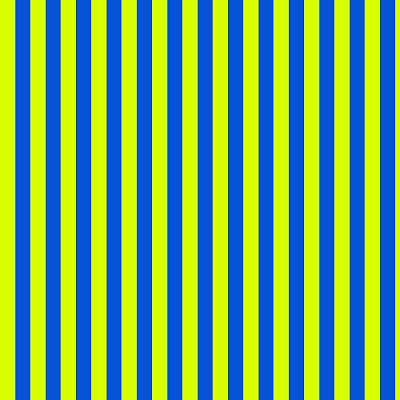


5. So now we have the waves. Let's make these into radial waves. Go into Filter > Distort > Polar Coordinates, and click OK once the dialog box pops up. Your image should now look like this:
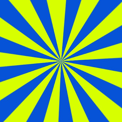


6. It looks kind of cool, but still plain. How about changing some blending options to spice things up? To do this, double click on the layer in the Layers Palette, and in the side toolbar, click Gradient Overlay. Leave all the options the same, except change the Blend Mode to Multiply. Obviously, you have to change the Gradient from the ugly defaulted grey gradient. To do this, click on the drop down arrow beside the Gradient option, and click the second little square - Foreground to Background. Now another dialog box should pop up, asking you to specify which colours you want. I chose two reds - a lighter one and a darker one, both within the same colour preset. With this reddish gradient overlay, your pattern should now look something like this:
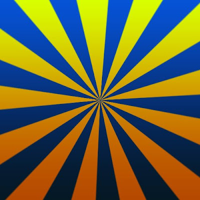


It could also look something like this:
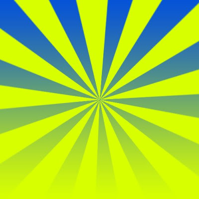


You can do a lot of things with this radial stripe effect. Here is an example - our magazine (Me, TA and HRs magazine).
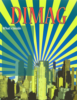


It's a very practical application, and it actually looks semi-okay... right?

Saturday, November 8, 2008

Brainface Branding: DS


Introducing the Nintendo DS Brainface Edition
Fun games, funner look.
Once again, sorry bad quality.

m.l.

Wednesday, November 5, 2008

Feild Assignment - Trying a new effect

I tried a new effect I found on photoshop - it's called the "Colour Halftone" effect. I used it to make a nice background =D This is the tutorial I made on how to accomplish this affect! Enjoy =)


Step 1: Go to the channels palette and make a new layer. It will be black, so take the lasso tool and make a selection where you want the pixles to be, and make it WHITE with the brush tool.


Step 2: Go Filter>Blur>Gaussian Blur and blur the black and white so that it looks well blended.


Step 3: Go Filter>Pixelate>Colour Halftone. This will make your blurred image have a bunch of circles that look like they are fading and getting smaller across the page.


Step 4: Take the majic wand tool and select the black spots. Then with what is selected, right click>similar, and the whole group of spots will be selected. Or to make it easier, when you have done the colour halftone part, right click on the dots (make sure they are all UNSELECTED) and choose Colour Range. Then a menu will come up for what colours you want to select (this is very easy cause it's just black and white xD)and the selection might be a little more accurate than the other way, but either way works fine, it all has to do with the options for the majic wand tool.


Step 5: Delete the entire channel cause you won't need it anymore. Take the selection of the dots you made to a new layer over the background layer on the "layers" palette.


Final Step: Use the Gradient tool and fill in the selection with some nice colours =) Add some more details (you can find brushes on the internet) and you're done! =D


Tutorial and screenshots made by: Vanessa. K
Program used: Adobe Photoshop CS3 + Wacom Bamboo Tablet

oops

the skinny fat one was by GB

make something skinny look fat