Here is my fast 5min flash video
BISCH
J.M
Tuesday, December 16, 2008
Wall-E Questions.
Wall-E Questions
1.What are some of the prevailing themes in Wall-E? List at least 3 and choose one to explain in greater depth. Explain your answer.
The three themes in Wall-E are environment, love, and adventure.
Humans are living in space because Earth is polluted and nothing can be grown. There is no life on Earth because of all the pollution and waste caused by humans.
2. How does the movie explore the theme? Give examples.
After about 200 years, a plant grows and shows that life on Earth is possible. When the humans find out, they come back to Earth and start all over again.
3. Wall-E uses references to 20th and early 21st century media, design, and society. Give examples. Why do you think these have been included in the film?
Wall-E uses references to the 20th and 21st century media, design, and society, to show that life of Earth is lively and happy. It also referred to these things to remind and educate the human descendants about their world.
4. Choose from the following: sound design, character design, cinematography, editing, script, architecture, lighting, character animation, or music. How was the particular element used to convey emotion, describe context, move the plot etc…Describe an instance in which your chosen element is used effectively.
Script. The script in the movie was unusual. In the beginning of the movie there are barely any words, yet we still clearly understand. Throughout the movie, the words you hear the most are “Wall-E” and “Eve” calling each other’s names. The way they say each other’s names describes the mood of the conversation. For example, when they are having an angry conversation, then the volume is louder than normal. When it is a sad conversation, they say their names slower and softer.
5. The movie uses repeated motifs (for example the cockroach getting run over). Describe one and explain why you think it is repeated.
Wall-E breaks down twice in the movie but he is able to fix himself or be fixed. This shows that many things can be fixed with the right tools and dedication. In the end, when Wall-E breaks and it seems like there is no way he will come to “life” again, Eve works hard to fix Wall-E and finally succeeds.
6. The robots take on human characteristics and the humans have taken on robotic characteristics. What does this serve?
This shows that humans are lazy and prefer comfort and entertainment over everything else. Since the robots are out doing human jobs, they start to behave like humans and the humans are clueless about their surroundings and they turn into robots.
7. Overall, would you describe this film as a “good” film? Why? Why not? What would you change?
Overall, Wall-E was a good movie. It was good entertainment and it showed us which direction humans are heading towards. The technology has made us lazy and as technology improves, us humans get lazier.
-H.R
Monday, December 15, 2008
Wall-E Analysis, By HM
1/2. Love is certainly the most prevailing theme in Wall-E. The romantic adventures between Eve and Wall-E form their own sub-plot to the movie’s main plot. The affection Wall-E has for Eve is apparent right from the beginning. When Eve lands on Earth, he is so amazed by her superior build, and her advanced features, that there is almost lust, more than love. However, these emotions develop into pure love, after having many exhilarating, near-death experiences and an adventure with a common goal, the pair grow closer together. Some scenes further emphasize the close affection between Wall-E and Eve. The most predominant scene that comes to mind is the scene where Wall-E and Eve are floating around in space, amidst the stars. Another scene that conveys the love between Eve and Wall-E is the hand-holding. At the beginning, and even throughout the movie
Some other themes explored in Wall-E are loneliness, and the adverse effect of technology.
3. Some examples of references to 20th century media, design and society include the repeated playback of a scene from the movie “Hello, Dolly!”, along with its soundtrack. Other examples include the rubik’s cube, the lightbulb, the flip-open lighter, and a vast assortment of other 20th century goodies in Wall-E’s “home”. These objects play a primary role in linking the future to the past; to show that despite the abandoning of Earth for hundreds of years, these objects have lasted. It certainly contrasts the old-fashioned Earth to the new, hi-tech life of the Axiom, and uses this symbolism to show the vast differences between Earth and the Axiom. However, despite the contrast, a concrete point is made clear, that the hi-tech life gets old after living in it for the greater part of most of your life. The references to the 20th century artifacts make it clear that no matter how advanced technology gets, it can never overtake good old fashioned life on Earth.
4. One of Pixar’s most revolutionary advancements in this movie was the use of character animation - more specifically, the ability to give robots human characteristics, while still making them believably robotic. This enormous feat was done outstandingly well, and Pixar was likely one of the few that could make it so successful. Some key features in some characters gave them distinguishable characteristics. For example, Eve didn’t even have a mouth, yet she talked. She had no facial features, except for eyes, and all the emotion was created predominantly with the use of the eyes, and slightly through the robotic voice. For example, when Eve was serious, her eyes were sort of frowning.

When Eve was laughing, her eyes sort of curved from the bottom, upwards.

The humans in Wall-E had simplified curves, and were extremely fat. The simplified, round, sort of squishy shape that the humans took on in the movie brought out their naivety, and hence, lack of control within their own society. Also, notice in the below picture that Eve is sort of surprised, and most of this emotion is brought out through her eyes.

5. One of the motifs in the play is the repeated playback of the same scene from “Hello, Dolly!”. At the beginning of the movie, this scene shows the extreme level of loneliness that Wall-E feels, where he longs for some company. We again see it in the company Eve, where Wall-E wishes to hold her hand, yet cannot gather up the courage to do so. When this soundtrack is played in the Axiom, it rings a bell of familiarity with the malfunctioning robots, who help Wall-E and Eve return the Axiom to Earth. This scene from “Hello, Dolly!” is essentially a symbol of hope and opportunity – for Wall-E to hold Eve’s hand, and for the humans to return to hope.
6. The apparent reversal of roles between the robots and the humans serves the purpose of showing the adverse effect of technology, that people become lazy, and dependent. Furthermore, they lose control of their own society, and all societal affairs. The same monotonous life is led on by the humans, day after day, almost like a program looping through each day, while the robots have a numerous variety of tasks to perform for the humans. The robots also have emotion, which contrasts the bored, plain face of the humans, as they progress through life.
7. Overall, Wall-E is a great film. The efficient use of many media techniques, as well as the superior animation by Pixar all contribute to the success of Wall-E. One thing I would change, although many would argue that it adds that extra touch to the movie, is have more dialogue. Although they are robots, and they are playing their role, viewers tend to get annoyed when there are only a handful of words spoken by the two main characters in the play. Essentially, all they say is “Wall-E”, and “Eva”, or “Eve”. One thing that can be unanimously agreed upon though, is that only Pixar could have gotten away with the lack of dialogue in the play.
by HM


Sunday, December 14, 2008
WALL-E Questions
Some prevailing themes in WALL-E are affection, the environment and co-operation.
Affection is shown between WALL-E and Eve when they first meet, and this connection continues throughout the movie. Affection is also shown between John and Mary when they are “freed” from their screens and make physical human contact. WALL-E also makes friends with M-O, the buffer robot that cleans the interior of the Axiom.
The environment is a large theme and is clearly shown when the images of earth in the future show it covered in garbage all the way into space. At the ending, the humans all come together and help clean up the earth and restore it to a livable environment.
Lastly, co-operation is a theme in the movie because the plot revolves around robot-robot co-operation, robot-human co-operation and human-human co-operation. The robots in the movie are all designed to work together to accomplish their duties. The robots also have to interact with the humans they are serving. The relationship between John and Mary shows human-human co-operation as they both help save a pile of children from sliding off the side of the Axiom.
On earth, WALL-E is fascinated with the old 20th century musical film “Hello, Dolly!”, and he also collects many objects from the 20th and 21st centuries like the spork or a metal flip lighter. I think these things were included in the film set in the 22nd century because they were prime examples of how the earth used to be and how the earth exists to us right now. Including them in the film helps the viewers make the connection of earths past as they view it in the future.
The character animation in the film helps show many aspects of the plot and emotion in the characters. The main characters in the film are robots, and they speak very little. Instead, they show their emotions mainly though body language and this is where the character animation comes in greatly. WALL-E and EVE’s facial expressions show their emotions and makes it easy to see how they are feeling in a certain situation. The animation also helps the plot, because it sets up scenes and even foreshadows upcoming events in the story.
A motif in the film that is repeated is how WALL-E always wants to feel what it’s like to hold hands with another, after he sees it in the movie “Hello, Dolly!” every time he watches it. He makes many efforts to try and hold EVE’s hand, but unfortunately he is unsuccessful most of the time. I think this was included in the film because it shows WALL-E’s attraction to EVE and the bond between them.
Since the main characters are all robots, it is them who get the most human characteristics in the movie, and the humans are dumbed down because they are not in as big of focus. It is also interesting to see it switched for a change, with the robots feeling emotions and the humans all zombie-like after hundreds of years slothing around.
Overall, I think this is a very good film, and one of the best animated films ever made. It has many subtle concepts of emotion and companionship and like almost every other great film, has an important moral at the ending. Love stories are also heartwarming and have happy endings.
J.M
Friday, December 12, 2008
Wall-e Stuff
1) Here’s three important themes from walle:
- Environment
- Love
- Ignorance/Laziness
2) How the movie explored the themes:
Environment:
Earth is unsustainable and humans have colonized in space to get away from it. When the captain finds out that earth is sustainable again, they go back. When they get there, earth is littered with mountains of garbage and haze obscures the view.
Love:
Walle meets Eve and shows her all his belongings. Eve eventually becomes inactive (kinda like a coma) and walle tries to protects her. Eve regains consciousness and they stick up for each other throughout the film. At the end of the film; walle breaks down and Eve repairs him.
Ignorance/Laziness:
- Computers give people a false reality
- “I can't just sit here and do nothing. That's all I've ever done! That's all anyone has ever done on this blasted ship…nothing” – Captain
- “I didn’t know we had a swimming pool” – fat lady
3) Wall-E has references to today’s society. Everyone had computers in front of their faces which gave them entertainment and a way to be social (ex. video games and FACEBOOK). They were also massive consumers and slaves to the market (ex. “red is the new blue”). They had forgotten the important things about life.
4) I really liked the character design of Walle and Eve, but more Eve. The eyes were quite simplistic, yet conveyed a lot of emotion depending on which lights were lit up. Sometimes the bottom half of her eyes lit up so she looked angry, but other times only the top portion of her eyes lit up so she looked happy. I used to think a mouth and eye brows were also needed, but I guess I was wrong. I also liked how they used movement to show expression; such as bobbing up and down to show excitement, and looking down to show disappointment.


5) Walle and Eve hold hands a lot throughout the film to show the friendship and trust between them.
6) The robots take on human characteristics and the humans have taken on robotic characteristics. It shows that we value laziness, comfort, and entertainment more than the other parts of life.
7) I think this is a very good movie because it’s one of the few pixar films where humans play a valuable role in it and deals with problems that are relevant to us today without completely shoving it in front of our faces. The only thing I would change is the ending because it was kinda corny watching all those fat people cheering for walle when they didn’t even know enough about who he was or what he was trying to do for them.
- Andy.S
Thursday, December 11, 2008
Wall-E Questions
1)What are some of the prevailing themes in Wall-E? List at least 3 and choose one to explain in greater depth. Explain your answer?
Some of the themes shown in Wall-E were Environment, Love and Exercise. Environment and love are simple to understand. Exercise was hidden, we saw humans sitting on chair for their entire life, and use to not do exercise. We as the audience should get the message out of it and should exercise so that we can stand up and protect our self when necessary.
2)How does the movie explore the theme? Give examples?
People in space have never stood up for a long time. We see them standing up in the end of the movie, when the captain shuts down the machine. We should learn a lesson, exercise otherwise you will be taken over by machines and there will be nothing you can do about that.
3)Wall-E uses references to 20th and early 21st century media, design, and society. Give examples. Why do you think these have been included in the film?
I think it was just to support one of the themes environments. One of the examples in the film was when Wall-E was watching T.V, the environment was clean and safe in the song they were showing; I think that it was to inform us about the environment, so that we keep it clean, live on earth and do not end up in any situation in which the only option we have is to leave earth on a space shuttle and been taken over by machines.
4)Choose from the following: sound design, character design, cinematography, editing, script, architecture, lighting, character animation, or music. How was the particular element used to convey emotion, describe context, move the plot etc…Describe an instance in which your chosen element is used effectively?
Sound design was one of the major element which made Wall-E an excellent movie. For example, the sound of Wall-E himself was something not common you do not hear it often. We did not see Eve speaking a lot, except for “Wall- E”. The voice of Wall-E and Eve let the audience know that Wall-E is a male robot and Eve is a female robot. The sound of the soundtrack was emotional depending on the satiation, e.g. when Wall-E got damaged Eve was looking for a new chip to get him going again, the music played at that time was touching.
5)The movie uses repeated motifs (for example the cockroach getting run over). Describe one and explain why you think it is repeated?
One of the parts shown quite a few times was the house of Wall-E. It showed the audience the amount of useful things that were considered waste and thrown away. It was just to let the viewers know that sometimes you think something is a waste but in reality it is not.
6)The robots take on human characteristics and the humans have taken on robotic characteristics. What does this serve?
Being what you have created is the worst thing to happen. Humans taking on the robotic character showed us that we will not have any life if we be like robots, just sitting on the chair roaming around doing nothing. We will be asking machines to do our work for us. Robots on the other hand will do more work that us and as a results we will be depended on the and they will be taking over us.
7)Overall, would you describe this film as a “good” film? Why? Why not? What would you change?
Overall the movie was first-class entertainment and comedy. The movie emphasized on environment, love and exercise. It made people think about the planet, it informs people to take care of it, do not waste lot. The thing I would change is the plot of Wall-E and Eve by making it longer because it was short. Otherwise the animation and the theme all were excellent I would rate it 4 out of 5.
Done By:
T.A
Wall-E
1. What are some of the prevailing themes in Wall-E? List at least 3 and choose one to explain in greater depth. Explain your answer.
Themes: Love, Environment, Technology, Care, Future
The theme of love is usually found in humans, but the addition of robotic affection was what got me in this film. The way that robots found love then extended it to the human characters was a great idea. The theme of love isn't just found between humans and robots, but also between humans/robots and our earth. The fact that a huge human population came back down to an abandoned earth to rejuvenate it and return it to its former beauty was heartwarming.
2. How does the movie explore the theme? Give examples.
The movie explored the theme of love quite effectively. Sound, atmosphere and repetition of movement helped convey the theme. Some examples would be the old love song replayed on Wall-E’s machine, the repeated emphasis on hands being held / touching and the calm, dim lit atmosphere of outer-space and Wall-E’s home with the lights easily comparable to the stars themselves. Lastly, the repetition of the robots saying each others’ names and the simple actions they performed for each other conveyed the theme very well (e.g. Wall-E walking up the chute to give EVE the plant, Wall-E taking of care of EVE when she was shut down on earth, and EVE taking care of Wall-E in return when he was broken).
3. Wall-E uses references to 20th and early 21st century media, design, and society. Give examples. Why do you think these have been included in the film?
Examples:
Rubics cubes, light bulbs, sporks, iPod, the design of the space ship is very similar to the Disney Cruise Ships
4. Choose from the following: sound design, character design, cinematography, editing, script, architecture, lighting, character animation, or music. How was the particular element used to convey emotion, describe context, move the plot etc…Describe an instance in which your chosen element is used effectively.
Character design was very vital in the movie Wall-E. The characters’ materials used describe the age of the characters and the physical capabilities they had (e.g. Wall-E was definitely an older robot with rusted old metal, with eyes easily comparable to binoculars while EVE’s look was almost inspired by an iMac with the slick, clean, and white design making her appear brand new). Since the first half hour of the movie was based on one character, they made the robot of Wall-E captivating to move the plot along by providing him with a happy, curious personality, along with giving him his own individual, unique life (compounding garbage, but saving certain items). The way they make his eyes adjust, or angle slightly definitely conveyed his emotion. I think character design was was used effectively throughout the movie whether it was Wall-E's, EVE's or the humans' design (useless fat lards). I think making the humans so useless was very effective to the human audience because it gives us a personal insight on how that can actually happen to us if we don't watch what we do with ourselves andddd the earth itself.
5. The movie uses repeated motifs (for example the cockroach getting run over). Describe one and explain why you think it is repeated.
Once again, the repetition of Wall-E folding his hands together displays his longing for love throughout the movie, and once you see EVE do the same, and then grab his hand, the unity really grips you because of that repeated motion done by one robot is what you’re so used to until then.
6. The robots take on human characteristics and the humans have taken on robotic characteristics. What does this serve?
I happen to think it’s very ironic in the way that at the beginning the humans are almost so robotic due to their schedules being the same all the time. The fact that robots like Wall-E and EVE actually have personalities and teach the humans what we now consider to be human is very interesting and thought invoking. It makes me wonder if we’re going to be come exactly what we create.
ML
Themes: Love, Environment, Technology, Care, Future
The theme of love is usually found in humans, but the addition of robotic affection was what got me in this film. The way that robots found love then extended it to the human characters was a great idea. The theme of love isn't just found between humans and robots, but also between humans/robots and our earth. The fact that a huge human population came back down to an abandoned earth to rejuvenate it and return it to its former beauty was heartwarming.
2. How does the movie explore the theme? Give examples.
The movie explored the theme of love quite effectively. Sound, atmosphere and repetition of movement helped convey the theme. Some examples would be the old love song replayed on Wall-E’s machine, the repeated emphasis on hands being held / touching and the calm, dim lit atmosphere of outer-space and Wall-E’s home with the lights easily comparable to the stars themselves. Lastly, the repetition of the robots saying each others’ names and the simple actions they performed for each other conveyed the theme very well (e.g. Wall-E walking up the chute to give EVE the plant, Wall-E taking of care of EVE when she was shut down on earth, and EVE taking care of Wall-E in return when he was broken).
3. Wall-E uses references to 20th and early 21st century media, design, and society. Give examples. Why do you think these have been included in the film?
Examples:
Rubics cubes, light bulbs, sporks, iPod, the design of the space ship is very similar to the Disney Cruise Ships
I think using objects that are so familiar to an audience definitely increases the interest in what we're seeing on screen, because we can relate to them and have our own stories with those certain objects.
4. Choose from the following: sound design, character design, cinematography, editing, script, architecture, lighting, character animation, or music. How was the particular element used to convey emotion, describe context, move the plot etc…Describe an instance in which your chosen element is used effectively.
Character design was very vital in the movie Wall-E. The characters’ materials used describe the age of the characters and the physical capabilities they had (e.g. Wall-E was definitely an older robot with rusted old metal, with eyes easily comparable to binoculars while EVE’s look was almost inspired by an iMac with the slick, clean, and white design making her appear brand new). Since the first half hour of the movie was based on one character, they made the robot of Wall-E captivating to move the plot along by providing him with a happy, curious personality, along with giving him his own individual, unique life (compounding garbage, but saving certain items). The way they make his eyes adjust, or angle slightly definitely conveyed his emotion. I think character design was was used effectively throughout the movie whether it was Wall-E's, EVE's or the humans' design (useless fat lards). I think making the humans so useless was very effective to the human audience because it gives us a personal insight on how that can actually happen to us if we don't watch what we do with ourselves andddd the earth itself.
5. The movie uses repeated motifs (for example the cockroach getting run over). Describe one and explain why you think it is repeated.
Once again, the repetition of Wall-E folding his hands together displays his longing for love throughout the movie, and once you see EVE do the same, and then grab his hand, the unity really grips you because of that repeated motion done by one robot is what you’re so used to until then.
6. The robots take on human characteristics and the humans have taken on robotic characteristics. What does this serve?
I happen to think it’s very ironic in the way that at the beginning the humans are almost so robotic due to their schedules being the same all the time. The fact that robots like Wall-E and EVE actually have personalities and teach the humans what we now consider to be human is very interesting and thought invoking. It makes me wonder if we’re going to be come exactly what we create.
ML
Wednesday, December 10, 2008

Tuesday, December 9, 2008

Wall-E Questions by: Brent NOT DONE DONT EVEN READ IT PLEAS
1. Some themes shown in Wall-e is affection, enviroment, and staying true to your roots. Affection was shown between Wall-e and EEeeeevvvaaaa. The Enviroment theme pretty much proves Al Gore's theories right, the human race actually had to leave earth it was so bad!!!!!!!!!!!!!!!!!!!!! Also, there was not ONE person of color on the cruise, all humans left are white. The theme 'staying true to your roots' is shown when the humans actually wanted to go back earth (when they found the plant), even though after all the hundreds of years they got used to doing seriously nothing (food in liquid form, not walking at all, etc. etc.) the humans stayed true to their roots and decided to relearn how to live on earth and to go back home
SONY
Scott s
Sony Advertisement- Sony usually advertises things through commercials, either in game or on TV. Sony isn’t doesn’t advertise each individual product they have, but advertise the main new, “WOW” items. Like PlayStation 3, new cameras or ext. But it is they’re job to commercialize new games for the PlayStation 3 console.
Sony Quality- Sony's products have managed to maintain a strong reputation. Despite sometimes carrying a higher price over other brands many buyers feel that Sony made solid, quality product and were willing to pay the price for the object. The PlayStation 3 was owned by manufacturing delays, there was a problem of all those Sony-made batteries, same with some digital batteries. Also Sony sound quality is something we really don’t think about, but they’re sound quality is known for bass. The base top over all other products, doesn’t have that rumble sound in the sound when you play music really loud.
What People Think Of Sony? – What people usually think what they here of Sony? They think of an expensive product to buy. Yes people know that it’s expensive but arguably the best brand out there overall. Teenage wise, if they heard Sony. first thing that comes up to they’re head is PS3, also known as PlayStation 3, which is an amazing game system. But the leading comparator Xbox has made higher sales then this product. Some argue quality is better for Sony but gaming still comes second to Xbox.
Sunday, December 7, 2008

Friday, December 5, 2008
HM Alternative logos
 here's a potential second logo. It's much more abstract than any of my other logos.
 glow-in-the-dark crick...
 and lastly, zebra crick
Posted by HM
crick logo... updated
Because my first few logos used a picture of a cricket from the web, here they are, drawn by me. I used the pen tool in photoshop to create paths, outlining multiple areas of the cricket.
Here is what I drew (by hand, in photoshop)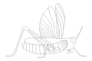 Now, adding a red monochromatic colour scheme, this is how it looks...
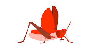 To fill it in, all I did was use the "Stroke Path" option in the "Paths" palette, and then just coloured directly onto the outline layer (which was a raster), using the Fill, Paintbrush and Pencil tools. I will be creating more sophisticated colour schemes at a later time, but for now, I can customize any part of the cricket I want - wing colour, eye colour, leg colour, etc. Furthermore, I can change the shape and size of any feature of the cricket I want - and the best part, it's not plageurized!
Posted by HM
Here is what I drew (by hand, in photoshop)
 Now, adding a red monochromatic colour scheme, this is how it looks...
 To fill it in, all I did was use the "Stroke Path" option in the "Paths" palette, and then just coloured directly onto the outline layer (which was a raster), using the Fill, Paintbrush and Pencil tools. I will be creating more sophisticated colour schemes at a later time, but for now, I can customize any part of the cricket I want - wing colour, eye colour, leg colour, etc. Furthermore, I can change the shape and size of any feature of the cricket I want - and the best part, it's not plageurized!
Posted by HM
Wednesday, December 3, 2008
Field Assignment - by HM

Here's my ASCII art. It was done in MS Word, by creating multiple layers, and overlaying them (textboxes). The actual Word file is in my hand in folder Mr. Bishop.
Thursday, November 27, 2008


Wednesday, November 26, 2008

Tuesday, November 25, 2008


SNARL Logo
 Snarl Snare Drums
We make TOP quality snare drums made of maple, oak, mahogany. Only the finest quality for the finest sound.
Comparing companies; Cover girl to Sweet tooth
Both companies are cosmetic companies for everyday life to high fashioned. Cover girl pretty much covers every kind of cosmetic you could think of. It seems to be for all age groups too. They have the normal everyday cosmetics to extreme out there colors such as ‘hot pink’ or ‘lime green’. Cover girl is one of the stop brands in the cosmetic line. There site helps everyone with almost any question that e thought up. They try every way they can to help their customers and viewers. Everything from applying makes up to what best suites your look.
What Sweet Tooth is leaning to is more of the out there colors and cosmetic articles. Such as; the colors are going to be bright and out of the ordinary not as cover girl who seems to broadcast for of the everyday modern kind of look. Sweet tooth will have everything from mascara to extreme bright lipstick. Cover girl has age-defying materials for females that are probably in there late ages and getting wrinkles. Sweet Tooth doesn’t cover that because they are leading more to the young aged people such as teenagers.
Their website will broadcast something sort oh what cover girl does. Sweet tooth after all wants to make their costumers happy and want to buy more of their product, also to tell others and make the company expand.
logo to come :]
kk
Monday, November 24, 2008

Brand Deconstruction - By HM
Brand 1: Nike
Nike’s professional site says it all. They precisely cut their brand into multiple sections. The different sections include the following:
Nike Store – for shopping online
NikeID – for customizing your products the way you want
Nike+ - a joint program between Nike and Apple
Nike Pro – for Nike underarmour, and related apparel
Nike Sportswear – for general sports apparel
Nike Women – Nike apparel specialized for women
NikeFootball, NikeBasketball, and NikeSoccer – for equipment relating to the specific sport.
Nike’s outstanding advertising campaign, along with their many customizable options are what make Nike so successful. For example, when you go to the site, one whole section is dedicated to NikeID – customizing your products the way you want. This will definitely be incorporated in my company. I plan to start with one product that will be totally customizable – including elements like colour of various features, logo style, and perhaps the material.
Another major advancement made by Nike is joining with other companies. This is especially evident in the Nike+ program. Partnering with Apple, Nike has created revolutionary equipment – using your Nike wear to track your running, etc, all on your iPod. The idea is ingenious, and brings profit to both Nike and Apple. I plan to replicate this idea by partnering with Apple, or perhaps some other company, and create some kind of training equipment (related to cricket), which somehow tracks your sport-specific achievements – for example, some small, portable device that tracks how hard you are swinging, and how many strikes you have made, and perhaps your accuracy. This could be done by making measurements of the force at which you are hitting the ball, based on calculations of acceleration and mass of the item.
Lastly, I will advertise my products just like Nike – by showing the viewers why my company gives the athlete the upper hand, and display the superiority of the product. In fact, Nike almost advertises its products as indestructible. Their products are portrayed as overcoming any challenge. An example of this is Nike’s advertisement titled “PROOF THAT COLD IS POWERLESS”, which advertises that “Nike Pro competition base layer will keep you warm, even when it isn’t.”
Brand 2: Reebok
Reebok is quite a unique brand. One would assume that it is quite similar to Nike. However, there are many differences. First of all, Reebok's advertisements do not have a dark colour theme. They are actually quite bright. Also, the advertisement is not centralized around the logo, but the logo fits in nicely with the people. There is not as much emphasis placed on the logo. This is both a good thing and a bad thing. While Nike's continous, repetitive advertisements about how their brand is superior does gain them quite a reputation, the reputation's integrity is weighted down by an aura of boastfulness. Reebok's, on the other hand, while it compromises the brand's instant recognition, upon glimpse of an advertisement, it also strengthens the integrity of its reputation. Now, because I'm just starting up, I think it would be a sound strategy to lean my advertising towards Nike's setup.
Another notable character of Reebok is it's clean layout (of it's website). It is easy to navigate to the page you want, and there are professional product shots, which show a clean, crisp side and top view of the product. My company will definitely mirror that style, when advertising the brand specifically. However, for advertisements within magazines and billboards, this would not be a great strategy.
Another great strategy employed by Reebok is their exploration of specific features, and a detailed description of their product. This stands out especially when examining their sports equipment. I will also employ that strategy into my brand.
Posted by HM
Brand Company Comparison
Outer Space..
All NASA missions had to do with moon and mars; some of them were just fixing satellites out in space. Virgin galactic takes you to space, according to website (http://www.virgingalactic.com/flash.html?language=english) the ticket is $200,000. The website has images of how the space looks like and it makes one wants to go and travel space. Space is a huge place to travel and discover new things. The craft designed by them will not take you to the places where NASA has been e.g. mars, to the satellites or the moon. Their website has videos which informs you about their company and their strategies. The creepy thing about their website was that their homepage had view the movie link which goes away and comes back when you take your pointer on it. My brand will also have a similar website and similar product. Since we know we do not have any images to post on our website but I am sure when it is out we will make you travel using out Aircraft. We will put commercials and ads on different magazines and newspapers. However we can not make you satisfied until you journey with us and try it yourself. We will be informing you about the updates of our brand. Keep looking for our ads and commercials on TV. For any question call us on the number provided on the website.
Done by : T.A
Thursday, November 20, 2008
Company H.R
Nike. "Just do it".
Nike makes sportswear and sports equipment. Nike is the biggest manufacturer of sports equipment.
Nike makes equipment for sports activities like association football, basketball, running, combat sports, tennis, American football, athletics, golf and cross training for men, women, and children.
Nike's annual revenues have increased from $6.4 billion in 1996 to nearly $17 billion in 2007, according to the company's annual reports.
Nike’s slogan is “Just do it". Its logo is the Swoosh that appears on all of their sportswear and equipments.
Nike sponsors many professional athletes. They make shoes and athletic wear for these professional athletes.
Sometimes when Nike tries to make lightweight shoes, the usually end up to be hard and uncomfortable.
Air Jordan
Air Jordan is a brand of shoes which was designed for and endorsed by the legendary Michael Jordan.
Michael Jordan personally designs his shoes. Every shoe that comes out is built with the latest technologies.
Air Jordan shoes are on the expensive side. Most shoes cost $200 and up. People still buy Air Jordans and love this brand because its products are classy and exceptional quality.
Air Jordan has made 23 signature shoes and some other retro. Air Jordan release new shoes every year.
Air Jordan is popular and known for as an elegant brand.
Air Jordan sponsors many professional basketball players, some football players, boxers, and a few universities.
My company’s name is Kicks. Kicks will manufacture mainly athletic shoes and casual wear shoes. My company will also produce athletic wear and equipment. But shoes are going to be my company’s main concern. The athletic shoes that Kicks make are go make are going to be made of the latest and the best technologies. For example, most of our football and basketball shoes will be made of carbon fiber to make them lightweight and durable at the same time. The running shoes will be light and soft at the same time. Many shoes that are lightweight are hard.
Comparing Comanies: NIke to Sureshot
Nike. The revolutionary sports company that dominates the market. I have decided that this company is the best comparison to mine because of the similar products and advertising strategies. Nike stands for athletics and getting kids outside to have fun with sports. They do this the best with their inspirational commercials usually with the same punch line “Just Do it”.
The commercials they create have the inspirational aura because the items they display they use to their max extent. Like the running shoes, they advertise people doing parkour in the new shoes and when I watch that it makes me feel like I want to get up and do that. Or the golf commercials. Since I am a golfer, whenever I see a commercial on Tiger Woods I really feel like going out and playing or working on my game. They use a lot of strategies that get people wanting to move and get active. These are very basic and range from anything like just showing clips of hockey or any other sport. These clips create a memory lapse and you remember the feeling of playing that sport creating an urge to play. This is a very smart but still basic way to advertise. But by doing this Nike is not only advertising their brand but the sport as well. This is very good for sports because some leagues are short players and when you have TV ads that create the urge for kids to play.
But Nike isn’t all about the advertising. In order for everything to work out you need to actually have a product that can talk for itself. By talk for itself I mean the product ahs to actually work, and with Nike they have pro’s that use and prove their product every day. This is what makes Nike so successful. As Sureshot, a new starting company for golf we have bought the golf section of Nike for a large amount of money. This will greatly help my company as it gives us a great starting base and an already great customer database. However, we will need to keep the same quality as Nike did which is why they have sold us all of their secrets as well as publicly stating our affiliation with each other.
We will have more updates as the products are currently going through the logo change and we will have surprises as to new clubs and styles. Stay tuned to see the latest and greatest from Nike presents: Sureshot.
G.B.


 My brand will be called crick. It will be specialize in sports equipment and apparel. Just like all the famous sporting goods companies – nike, adidas, reebok, etc. – my company will have different departments, depending on sport. Initially, I think I will start off with cricket. It makes sense, because that incorporates half of the company’s name already. Additionally, I had a few ideas about cricket advertisements. I’ve thought about the different angles, and eliminated many potential snapshots of a cricket batsman. I’ve analyzed many different positions of the batsman. A few of them include when the batsman is midway through his swing. Another is from behind the batsman, as he looks out at the shot he has just made. Of the many other’s I have looked at, I have specifically narrowed my first cricket advertising campaign to a front view of a batsman, after he hit a shot. The actual advertisement will obviously have to take some more time. I look to expand my company to incorporate many other sports, although I am still contemplating whether I should concentrate all my efforts into one sport, or try to steer my company towards many different sports.
Getting back on topic, the aesthetic of my band will largely be similar to Apple’s advertising campaign – simple, yet effective. Although my company cannot fully be compared to Apple, it will follow the same advertising techniques. I look to simplify everything around the logo, and place emphasis on the logo. My advertising will also mirror the nike commercials in some sense. I will capture athletes in the middle of a action related to the sport. These snapshots will convey feelings of motion, and power. However, because the emphasis will largely be placed on the logo itself, it will further empower the brand. This will help develop the metaphor that my company will bring that invigorating edge to the athlete.
My logo will also be simple, yet instantly recognizable (quite similar to Apple and Nike, and mostly all successful companies). The name is easy to recognize, simple while still maintaining a visual appeal. Above are a few preliminary sketches for my logo.
By HM
Comparing Companies
My company’s choice of product would be skateboards and skateboard accessories. Clothing would also be sold in my company; the name of my business is Rough Riders. I would be comparing my brand to Baker Skateboards.
Baker’s skate team image is mostly comprised of people who enjoy being hooligans and reeking havoc. Only doing what is best for their interests and not for the majority of the public. This would be the sort of image that this company would try to go for because we don’t want to be corporate sell outs and be all about the money. The team is known for doing a lot of drugs and drinking, this has been one factor that has sold Bakers image and has distinguished them from other skateboard companies, and because of this we wouldn’t want to steal this idea, people would think of us as idiots for doing this and I would have to agree. We are going to keep ourselves fresh with the illest fabrics so that everybody will buy and represent our product. Our choice of advertising would be in magazines like Thrasher and Transworld to get our brand name heard. Word of mouth would also be a very important. Baker is a legit company, owned by a skateboarder, for skateboarders. Rough Riders would definitely take this in for account because it’s important for our customer to know that we are making our products because we love skateboarding. Rough Riders will be known to people as people listening to loud music riding motorcycles and skateboards.
T.A

Tuesday, November 18, 2008

Thursday, November 13, 2008


Wednesday, November 12, 2008


Field Assignments - 2.Found Typography: create a word or sentence using photographs of letters.
 My Name!!!Derrick Cheng ----^
By Derrick Cheng
Tuesday, November 11, 2008


Subscribe to:
Comments (Atom)